In the final installment of the Red Alpine Rose designed by Trish Burr,
we'll work on the flower, especially the petals. There will be lots of
blending practice and I'll show you a slightly different way of approaching
shading.
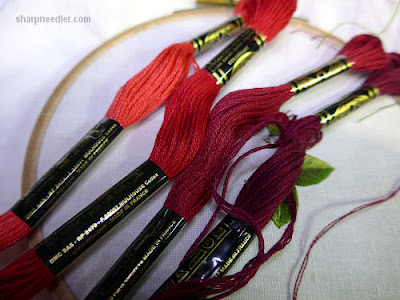
The flower petals are composed of four reds. I think of them as shades 1
through 4 with 1 being the lightest.
Before jumping into stitching the petals, I want to mention the colour
selection for this project. It's deceptively simple and beautifully elegant.
Trish Burr is an absolute master at choosing thread colours. She makes it look
easy, but it's not. I see many examples of shading that are lacking because of
poor colour selection. There are abrupt jumps in colour and the shades don't
blend very well. You can have great technique, but if the colours don't work,
it doesn't matter. We should all appreciate Trish's exquisite colour sense and
her ability to do amazing things within the limitations of thread palettes!
Technically, all of the petals are stitched in the same way. The lightest red
(1) is on the outer edge and there's an orderly progress through the shades (2
through 4) towards the flower centre.
When I look at the reds, I see three shades and a shadow. The darkest red
could become quite heavy if there's too much of it on the petal. So, I will
treat the petals as if they are really composed of (mostly) three shades and
then add in a little bit of shadow at the end.
One of my rules for blending is that I don't let non-sequential shades touch
each other when I want a smooth blend. So, for example, with the petal reds
there are four shades starting with 1 at the edge of the petal and progressing
through 2, 3, and 4 towards the centre. I would not let shades 1 and 3 touch
each other, 2 would always come in between. This produces smooth well-ordered
blending (as long as you have well-chosen colours).
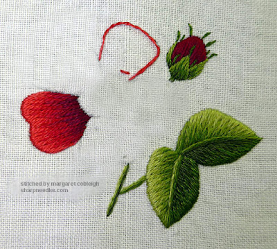
To start, choose a petal that is in the background. I have three petals that are behind and two that are in front or overlapping the background petals in some way. Depending upon how you traced the petals you could have a different layout.
I've drawn three blending lines on the petal for the three main reds and the petal will be almost completely filled with those three shades. The shadow colour will be added at the end.
Outline the petal's edges with split stitch, but only the edges that belong to the petal. Then, start in the middle of petal and work to either side with long and short stitches just like the leaves. Remember, it's really just a raggedy-edged satin stitch.
Below, I've embroidered the first half of the petal and will go back to the
middle and stitch the other half. Recall that on the first row, you come up
inside the petal and go down over the outside split stitched edge ensuring
that the design line is covered. Make sure to place the stitches right next to
each other and keep the petal edge as neat as possible.

For subsequent rows you can, again, start in the middle and work to either
side blending in the colours. That's the proper way to shade. If you're a
beginner, you should definitely try this method. However, I'm going to show
you how
I shade which is a little bit different.
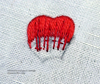
When I blend into subsequent rows, I first scatter a few longish stitches into the previous row. The starting points are staggered. (As usual, I come up in the previous row and go down into the unstitched area of the petal.) The photo below has been enhanced to try to show the scattered stitches. These foundational stitches are used to establish the deep stitches. It helps me not get hung up on long and short or get into too much of a rhythm with the embroidery. I want randomness not automation. It also makes me look at what I'm doing and pay attention to where the colours should go. Once these long stitches are in place I go back and fill in with more stitches in between. I think of this as sketching with thread. Because I jump around with the stitches the back is not necessarily very neat, but the front is what matters!
When I blend into subsequent rows, I first scatter a few longish stitches into the previous row. The starting points are staggered. (As usual, I come up in the previous row and go down into the unstitched area of the petal.) The photo below has been enhanced to try to show the scattered stitches. These foundational stitches are used to establish the deep stitches. It helps me not get hung up on long and short or get into too much of a rhythm with the embroidery. I want randomness not automation. It also makes me look at what I'm doing and pay attention to where the colours should go. Once these long stitches are in place I go back and fill in with more stitches in between. I think of this as sketching with thread. Because I jump around with the stitches the back is not necessarily very neat, but the front is what matters!
Below, the second row is complete. Notice that the shape is almost entirely
filled with the first two shades. There's lots of colour to blend into for
the next row!
Here's the third shade. I also used my 'sketching' method when adding this
row. I've left a little bit of space along the edge of the flower centre for
the shadow stitches.
Finally, the shadow is added. I try to make sure that there is some shadow colour along the edges where the other petals will eventually overlap. This helps create the illusion that the petals on top are making a shadow on the petal(s) underneath. Don't overdo the shadow. It can get muddy very quickly.
Contrast
Before filling the foreground petals, let's discuss a little bit about contrast.
Here is an example of poor contrast. It's from a Trish Burr design (Pansies) that I did quite a while ago before I really started paying attention to
contrast. The lower petal on this pansy is not well executed. There's no
contrast between it and the side petals. They merge into each other in a dark
mass of colour. If I was stitching this today I would ensure that the lighter
colours of the lower petal were placed along the edges towards the center so
you could see the petal edges in comparison to the side petals beneath. The
side petals could be improved as well, but at least you can see the (upper)
petal edges. It's low contrast, but there is some contrast.
This is an example of better contrast. It is another Trish Burr design (Victorian Pansies) where I focused on contrast. You can clearly see all the petal outlines created by the use of shadows on background petals and lighter colours on foreground edges. (It almost looks like some of the petals are outlined, but there are no dark outlines embroidered on any of the petals. I don't care for stitched outlines.)
If you are a beginner, don't overly concern yourself about contrast for now. You have to get the stitch direction and blending working first. Worry about contrast later.
A Lesson in Outlining One Element at a Time
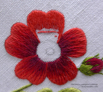
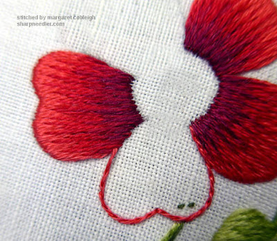
Below, I'm in the process of outlining the first foreground petal.
This is a good example of why you don't outline all elements first and then
fill. Notice where I've temporarily stopped outlining. If I had outlined
this petal before working the petal beneath--where I've stopped
the outline--it would have been difficult to stitch the background petal
without biting into the upper petal's outline. Also, the background petal
isn't perfectly filled, but I can use the outline to cover that up. It's
much easier to do outlines as you go, rather than all at once at the
beginning.
Once the outline is complete you can't tell that the petal underneath has a bit of a ragged edge. You'll get a neater finish when you have a clean outline on top. I also didn't have to try to stitch underneath this outline when filling the background petal which is easier. So, you'll get better results and it's easier if you outline elements as you go. That's a win-win!
Filling the Foreground Petals
The foreground petals are filled with the same four shades of red as the background petals. You can work them the same way as the background petals. However, for extra credit, and if you are comfortable with tackling contrast, stitch lighter edges where the petals overlap the petals underneath.
Here shade 1 has been stitched all the way around the petal. I don't know
that I will keep this much of shade 1 showing, but I have the option to do so.
Shade 2 is added:

Shades 3 and 4 complete the petal. I ended up not showing very much of
shade 1 around the edges. There was too much contrast with the
neighbouring petals. There's not a lot of contrast on the left side of
the petal, but more than the photo indicates! The lower left petal,
which is also a foreground petal, has better contrast on the petal edges.

With the petals complete the rose is nearly finished.
Intermission (aka Gratuitous Kitten Picture Time)
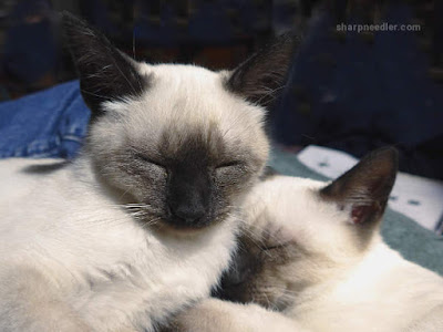
You never want to look down and see this when you are stitching:
They are way too interested in something, a scissors fob in this case. Those looks means trouble.
I like them better this way. It's much safer for my embroidery!
You never want to look down and see this when you are stitching:
They are way too interested in something, a scissors fob in this case. Those looks means trouble.
I like them better this way. It's much safer for my embroidery!
Flower Centre
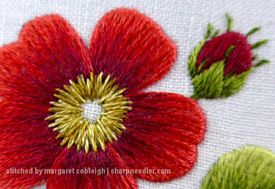
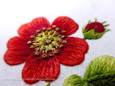
The flower centre consists of two shades of golden brown:
In the original instructions, the lighter golden brown is straight
stitched around the center and the darker shade is used for French knots
in the centre and around the edges of the straight stitches. I'm going to
do something a bit different by embroidering the straight stitches around
the centre with one strand of each colour in the needle. I want to see if
it will add a little depth.
For the French knots, I used two strands and two wraps. The original instructions called for a single strand and
two wraps, so my knots are bigger.
There are three
possible combinations with two strands and two colours: all light, mixed,
all dark. I used all light for a few knots in the centre. I mostly used mixed for the knots in the middle and around the edges. I
also used some all dark in the centre and around the
edge. I like the results and it looks richer than if I'd only used single
shades, but there's not a lot of contrast and the knots in the middle get a
little lost. If I had it to do over, I'd probably use mostly all dark
knots in the centre with a few mixed knots. I don't think I'd change the
outer knots.
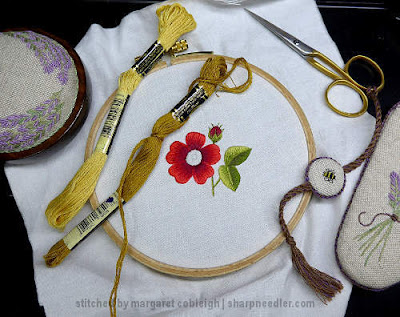
The little rose is complete:
This is a good introductory thread painting design and there are many
more in Trish's book. I hope you have a better feel for shading and that
I've been able to remove some of the mystery from the technique. It really
isn't difficult, but does require practice.
(Please visit the Gallery to view
the other lessons for this project.)









I had intermissions just like you have. I preferred to call them 'Interuptions'.
ReplyDeleteOliver could have lived on Appleton Crewel Yarn, especially green. If I did not
pay attention, big messes interupted the process. I had to change to needlepainting. I do enjoy what you post. Thank you.
Yes, it's a challenge stitching with kittens, but they won't be kittens forever and I'm trying to enjoy every possible moment with them while they're little. They're my last kittens. :-( Considering what trouble they could cause, they're being pretty good.
DeleteI really appreciate these three lessons of the Red Alpine Rose, which I stumbled upon after a mention in a post on Mary Corbet's site. I recently purchased one of Trish Burr's books and have still been a little too intimidated to start a project. These lessons have really broken needlepainting into logical steps for me, and I feel it's much more accessible than I'd first thought. One of the things that really opened my eyes is how "deep" the rows go into (maybe "under" is more accurate) the subsequent/later rows. Suddenly it all makes sense. Thank you so much for breaking it down.
ReplyDeleteOh, I'm so glad you're finding the information useful! I try to share things I wish I'd known when I was learning embroidery.
DeleteDon't be intimidated, it's only embroidery. What's the worst thing that could happen? If you don't try, you'll never know if needlepainting is for you. I would say, though, that it's probably better to start with something simple and work towards the more complex designs. Needlepainting does require practice, so if it doesn't like exactly the way you think it should at first, keep working at it. It'll get better. Let me know if I can help.
Delightful ! :)
ReplyDeleteThank you! :-)
DeleteThis lesson is exactly what I needed to learn. Thank you so much for posting. My thread painting skills are much improved.
ReplyDeleteI'm so glad it was useful to you. I was hoping I could help people with thread painting.
DeleteLovely work. By the way, age doesn't improve the 'help' your lovely cats will give you😹. Everything still has to be investigated, munched, run off with or hidden! Take it from an 'expert' feline Mum. They adore offering a helpful paw, or 4, or in your case, 8. Good luck!
ReplyDeleteThank you for the compliment.
DeleteAs for the cats, well, the youngest ones are now four as I write this and they are calmer. Generally, none of the cats likes to share my lap with another cat, so I only have to deal with one at a time. They still like a bit of dangly thread or a scissors fob, though. They conk out in the late afternoon, so that's usually a 'safe' time to stitch. They are all very good company.