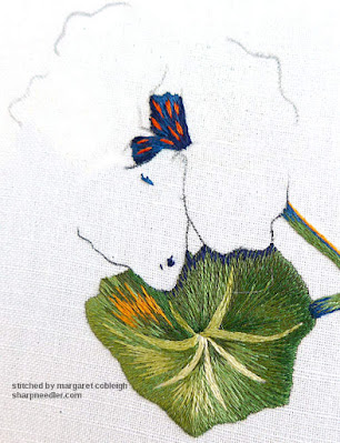
If I didn't like orange I'd be in big trouble with the Laurençon nasturtiums. I can't say that orange is my favourite colour, but it is certainly a fun shade to stitch with.
This is the palette for the flowers. It seems rather tame in the photo, but not when stitched. Get ready for some vibrant embroidery!
After completing the big leaf it was time for the main flower starting with the centre, which is blue with slashes of orange. I stitched it as directed in the instructions. I'm not exactly sure what it is, but I like it. The blue will nicely set off the orange of the petals.
I also added some shadow lines in dark blue on the leaf where the petals will overlap. I've enhanced the photo below to bring out the shadow lines. This is a first cut at the shadows. I expect to go back later and tweak them.
Starting on the flower petals, I had two 'back' petals from which to choose. I chose the one in the photo below because it was easier. The other choice was one of the petals that overlaps the leaf. Since I wasn't done with the shadows I wanted to wait.
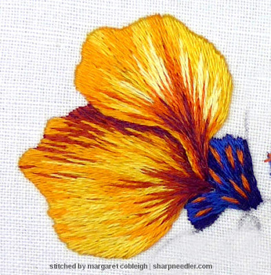
I really like the way the first petal turned out. It looks like fire!
The next petal overlaps the first and I wanted to create good definition (contrast) where the petals meet. The edge of the upper petal should not get lost where it meets the lower petal. The shadows on the lower petal were deepened to help ensure that the colour on the left edge of the upper petal would 'pop' where the two petals meet.
When the second petal was finished, I realised that the style of its stitching didn't go with the first petal and I preferred the look of the second in the context of the overall design. Oh, dear! I spent several days ruminating over what to do with the first petal. I liked it so much, but it just didn't work. It was too busy, too dramatic. (Unfortunately, I don't have photos of the two petals at this stage.)
I certainly wasn't going to rip out the first petal, but I had to do something. There was too much dark colour and it needed to be lightened up. The beauty of thread painting is that it's very flexible. I merely stitched--carefully, of course--over the top of the existing embroidery and 'erased' some of the dark colour. Here's how it turned out:
I'm very pleased with these two petals, especially the upper one. It has a really good directional flow and a nice fine line of lighter colour along the edge that sits on top of the lower petal. That was achieved by stitching over the top of half of the thread (or perhaps more), leaving just a sliver showing.
Another thing I enjoyed on the upper petal was blending non-contiguous shades. There are lighter yellows that blend with dark oranges. This is unusual in needlepainting kits/projects. The progression of colours is usually more subtle and orderly. To me, this is where Ms. Laurençon really shines. She's done a masterful job of choosing colours for this project and it's been a pleasure to embroider it.
Then it was on to the next petal, the one on the lower left overlapping the big leaf.
This is a good time to explain why I prefer a working order of background to foreground elements. If I embroidered the petal first, I'd then have to stitch the leaf 'underneath' the petal. That's harder than stitching the petal on top of the leaf. If I did the leaf after the petal, I'd have to use care not to nip the edges of the petal. Also, if you stitch the leaf first, it's easier to ensure that there are no missing stitches and that it's all filled in around the edge where the petal will overlap.
When I first started thread painting, I worked from foreground to background and it's doable. I don't remember why, but about 10-12 years ago I reversed the order. It's much easier and yields better results.
Here's the current status of Capucines in all its thread-parked glory. I do a lot of thread parking so I can keep my options open. I can't wait to see how the third petal turns out!
Winter 2026: Google ended its email subscription service in 2021. I believe I've found a replacement, but haven't had time to test it. I have been stitching a little bit here and there and have some posts ready for when the email subscription is active again. Fingers crossed, I'll have time to rouse this blog out of its dormancy sometime in 2026.


Oh wow this is stunning! I really like Ms Laurencon's approach to blending colours. It is so much more dramatic.
ReplyDeleteIt is a *lot* of fun stitching with these bright colours. I highly recommend it! :-)
DeleteIt is lovely! Can't wait to see further progress . . .
ReplyDeleteIt's just about finished. Stay tuned.
DeleteAmazing! I loved the first petal, but seeing the changes you made to bring it in line with the second petal I totally agree that it suits the overall feel of the piece better. What a difference a few stitches make in needlepainting :)
ReplyDeleteIt was soooo hard covering over those lovely dark bits! I try not to think about it, but I think it looks better. At least I have photos of how the petal looked originally. Thank goodness, needlepainting is so forgiving.
DeleteI thoroughly enjoyed this post. Your work is beautiful... Margery
ReplyDeleteThank you so much, Margery. I'm just about finished with the flower and can't wait to share it!
DeleteLoving these vibrant colors!
ReplyDelete